This is my first draft made on paint.net of my magazine advert. To do this, I created text boxes in Microsoft Publisher, then pasted the images into paint.net, as text is quite difficult to manipulate in paint.net. I plan to get some feedback from my target audience, then I will upload my final magazine advertisement.
Friday, 11 March 2016
Friday, 4 March 2016
Organisation: Construction.
Firstly, I added images in by 'inserting them from file.
I then added the text within Page Plus, did the same as above to add the bar code, and mimicked the text on Breaking Benjamin's Dark Before Dawn album for the record company information on the bottom of the CD
Lastly, I manipulated the colours of the second (back cover) image. I chose a light purple wash instead of grey or plain black, as using grey or black would have been too depressing with the ashtray and alcohol still there.
Monday, 29 February 2016
Drafting & Planning: New footage.
Although I like my first music video draft, some parts needed to be improved. One part was 'Champs Elysees', as the video that went with the lyric was irrelevant. To improve this, I have taken some new footage:
I chose to use a cigarette to link to the French avenue, to use the stereotype of a single main character smoking a cigarette in French films. I used a space in a computer classroom in my sixth form, as I still wanted an aspect of technology to remain in the background.
I feel as though the plain white of the walls contrasts well with the stereotypes about Paris and love, as mentions of Paris bring up the idea of natural romance, yet my video is about the darker side of romantic attraction.
I feel as though the plain white of the walls contrasts well with the stereotypes about Paris and love, as mentions of Paris bring up the idea of natural romance, yet my video is about the darker side of romantic attraction.
Friday, 26 February 2016
Research into similar products & Drafting and Planning of the magazine advert:
Research into similar products:
I decided to look into many different genres of music magazine adverts to evaluate whether alternative / indie rock albums have different conventions. I have found that the conventions remain very similar, even in sou music advertisements.1:
I decided to compare it to the CD that goes with this advert, to see whether it is holistic, or different. This is the enlarged version of the CD cover featured on the advertisement:
This CD has similar colour tones as its advert, with a red-white block colour, which fades into a very soft pink colour in the advert. The image in the back of the advert is the pink-tinted version of the clear image on the CD cover. I really like this effect as it gives synergy to the advertisement campaign while still easily catching a magazine reader's attention.
2:
This advert is similar to the above and below adverts as it also features a weblink. As well as this, the colour scheme is exactly the same as the album cover, along with the unusual use of large amounts of text. This advert also features ratings and an 'out now' which replaces the 'The Vaccines' release date.
3:
Similarly to the adverts above, this advert has the exact same colour tones as the CD cover. As well as this, like the 'The Vaccines' advert, a smaller version of the CD features on the advertisement, as well as many ratings and a web link.
Drafting & Planning:
I have developed a draft advert out of combined elements of the similar products which were analysed above:
Tuesday, 23 February 2016
Drafting & Planning: Digipak photoshoot results.
I will use either 2 or 5 in my digipak tray. If possible, I will add both, with the plain ashtray at the bottom of the tray and the ashtray with the fake cigarette as the disk, so as a fan you will be placing the cigarette into the tray.
Sunday, 21 February 2016
Organisation: Digipak photo plan.
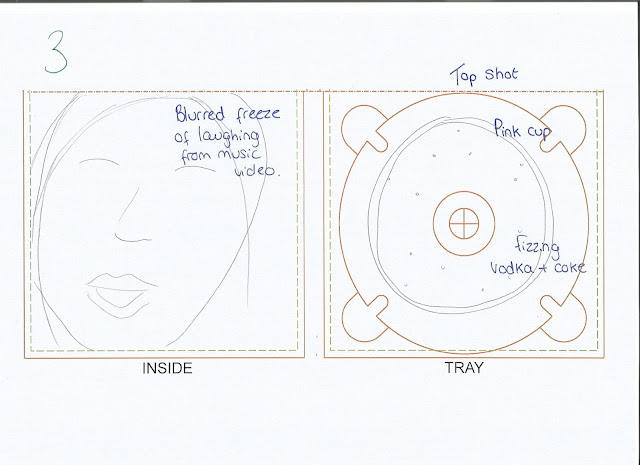
Firstly, as I have chosen the top shot of the ashtray to be my CD base, I will take photos of the fake cigarette's I purchased in the ashtray. The photos will then later be manipulated, such as blurring the image or setting it to grey scale.
Secondly, although I like the vodka bottle in-tray, this will be too repetitive, as I have also chosen a vodka bottle to feature on the back cover of the CD. I currently have not decided on what my in-tray will be like, although I have considered a block colour, such as grey or black, similarly to the in-tray of Arctic Monkeys AM album.
My photography will take place on the 22nd of February, and should be complete by the 23rd.
Friday, 19 February 2016
Subscribe to:
Posts (Atom)


